Accordion component
Display content in collapsible sections.
This guide demonstrates how to add the Accordion component. The Accordion component allows you organize content in collapsible sections, showing only titles, subtitles, and labels at first. While it’s mainly used to display course information on the People content type, it can also be helpful for FAQ pages, histories, or timelines.
Step by step
To add the Accordion component:
- On the page you are creating or editing, select the Component tab. Then, tap the Components drop-down.

- Choose Add Accordion.
- The component will appear. Complete the following fields that will be displayed when the accordion is closed or expanded:
- Accordions Section Title - If desired, enter a section title. This will be displayed as a heading above the accordions. For example, if you are creating multiple accordions about different courses, a section title "Courses" would be appropriate.
- Accordion Title - Enter the title for the drop-down item. For example, a title of a course.
- Accordion Subtitle - Enter a short description for the item. For example, the course number.
- Accordion Label 1 and 2- If desired, enter a label. Label 1 appears on the top and Label 2 appears on the bottom. For example, Label 1 could be a course descriptor (2 credits) and Label 2 could be the term (Fall Term).
- Next, enter the Accordion Content. This is the body of the content that will be displayed only when the accordion is expanded.
- To add another accordion section, select Add Accordion Item, found at the bottom of the first accordion.
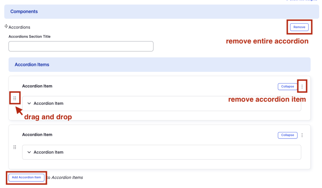
- Additional actions you can take include:
- To move or rearrange the order of items, drag and drop a section to the position you'd like using the 6 dots, found to the left of the item.
- To remove a single resource, tap the three dots within the item section, then select Remove.
- To delete the entire component, tap Remove. Then, tap Confirm removal.
- Select Save. If you are ready to publish your page, ensure the Published toggle is enabled (green in color).
Example
Front-end
Accordions Section Title
Accordion Title 1
Accordion Subtitle
Label 1
Label 2
This is the "Accordion Content" for Accordion Item 1.
Accordion Title 2
Accordion Subtitle
Label 1
Label 2
This is the "Accordion Content" for Accordion Item 2.
Accordion Title 3
Accordion Subtitle
Label 1
Label 2
This is the "Accordion Content" for Accordion Item 3.
Back-end