Additional Resources component
Display quick links with a background image.
This guide demonstrates how to add the Additional Resources component to help visitors to quickly find important information in a visually appealing way.
Step by step
To add the Additional Resources component:
- On the page you are creating or editing, select the Component tab. Then, tap the Components drop-down.

- Choose Add Additional Resources.
- The component will appear. Complete the following fields:
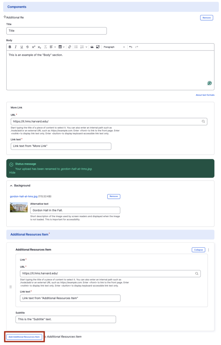
- Title - Enter the title of the overall section. For example, "Additional Resources".
- Body - Enter a short description of the resource.
- More link
- URL - Enter the URL of the page the user will be brought to.
- Link text - Enter a title that describes the link destination. For example, "IT Org Chart".
- Background Image - If desired, upload a background image for the section. Note that your image must be watermarked before uploading to accurately display the text. If you do nothing, the HMS Logo will appear by default as your background image.
- Additional Resources Items
- URL - Enter the URL of the page the user will be brought to.
- Link text - Enter a title that describes the link destination. For example, "IT Org Chart".
- Subtitle - If desired, enter a short description of the link destination. For example, "Learn more about the IT infrastructure."
- To add another column with a new section heading, select Add Additional Resources Item. The recommended number of resources are 2-3.
- Additional actions you can take include:
- To move or rearrange the order of items, drag and drop a section to the position you'd like using the 6 dots, found to the left of the item.
- To remove a single resource, tap the three dots within the item section, then select Remove.
- To delete the entire component, tap Remove. Then, tap Confirm removal.
- Select Save. If you are ready to publish your page, ensure the Published toggle is enabled (green in color).
Example
Front-end
Title
This is an example of the "Body" section.
This is the "Subtitle" text.
This is another example of the "Subtitle" text.
Back-end