Hero with Program CTA box component
Add a Hero title image with links.
This guide demonstrates how to add the Hero with Program CTA box component.
Note - This component is only available on select sites.
Step by step
To add the Hero with Program CTA Box component:
- On the page you are creating or editing, select the Component tab. Then, tap the Components drop-down.

- Choose Add Hero with Program CTA box.
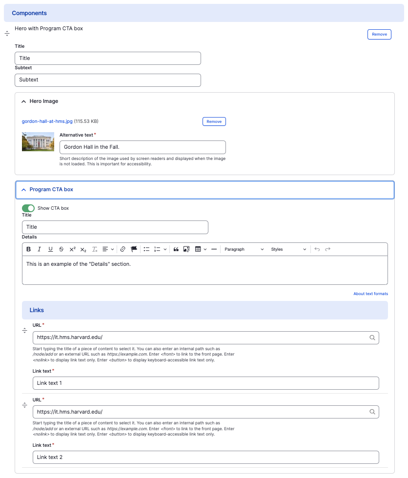
- The accordion component will appear. Complete the following fields that will be displayed when the accordion is closed or expanded:
- Title - Enter a title, which will display in large font.
- Subtext - Enter a short description for the item.
- Hero image - Add an image, which will display to the left of the text. Select Add Media, then select an image from your desktop. Review DAS's helpful hints for writing alt text for images.
- Program CTA box
- Show CTA box - This is enabled by default. See examples below.
- Title - Enter a title for the content.
- Details - Enter a short description of the content.
- URL - Enter the URL of the page the user will be brought to.
- Link text - Enter a title that describes the link destination. For example, "IT Org Chart".
- Additional actions you can take include:
- To move or rearrange the order of items, drag and drop a section to the position you'd like using the 6 dots, found to the left of the item.
- To remove a single resource, tap the three dots within the item section, then select Remove.
- To delete the entire component, tap Remove. Then, tap Confirm removal.
- Select Save. If you are ready to publish your page, ensure the Published toggle is enabled (green in color).
Example
Front-end: "Show CTA box" enabled

Subtext
Title
Title
This is an example of the "Details" section with "Show CTA box" enabled.
Subtext
Title
Back-end