Shoutout component
Visually showcase important text and links.
This guide demonstrates how to create a shoutout feature using the Shoutout component.
Step by step
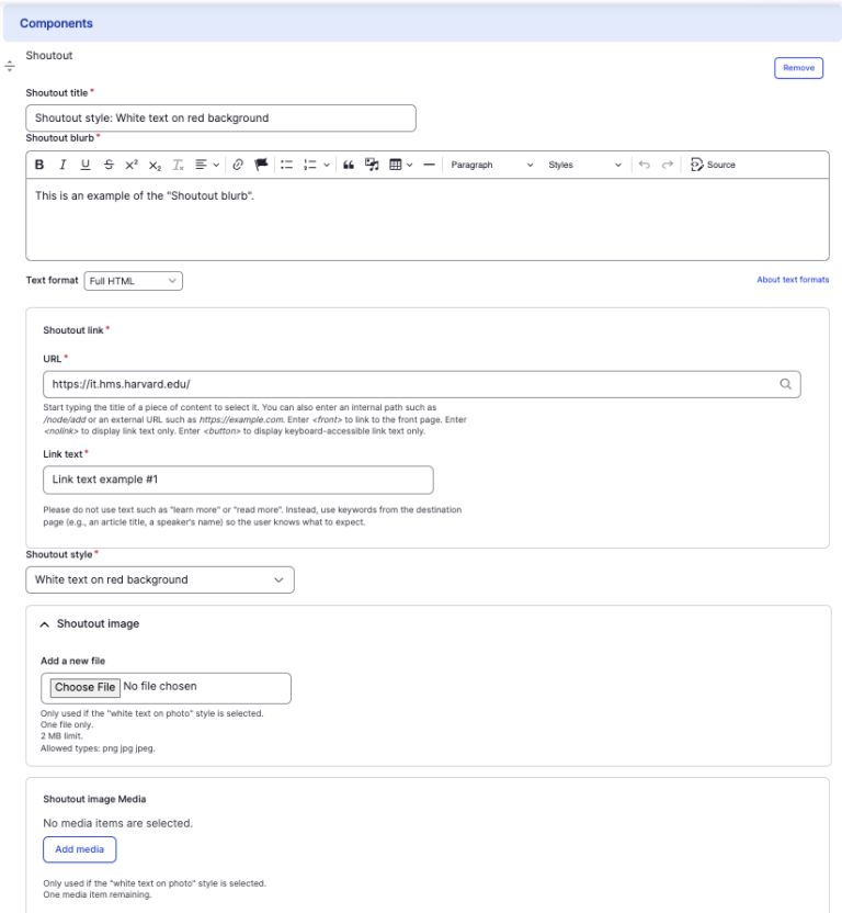
To add the Shoutout component:
- On the page you are creating or editing, select the Component tab. Then, tap the Components drop-down.

- Choose Add Shoutout.
- The component will appear. Complete the following fields:
- Shoutout Title - Enter a title for the section. This will appear as the largest text.
- Shoutout Blurb - Use the WYSIWYG editor to construct the body of the text.
- URL - Enter the URL of the page the user will be brought to.
- Link text - Enter a title that describes the link destination. This is the text displayed in the clickable button.
- Shoutout style - Choose from three options of how the shoutout will appear. Examples of each can be found below.
- Option 1: White text on red background
- Option 2: Black text on white background
- Option 3: White text on photo background with overlay
- If you choose option 3, you must upload an image which will display as the background image. Select Choose File, then select an image. Review DAS's helpful hints for writing alt text for images.
- Note - Although the image will be overlayed to better display the text, be mindful of choosing an image that ensures sufficient color contrast.
- To delete the entire component, tap Remove. Then, tap Confirm removal.
- Select Save. If you are ready to publish your page, ensure the Published toggle is enabled (green in color).
Examples
Front-end
Shoutout style: White text on red background
This is an example of the "Shoutout blurb".
Shoutout style: Black text on white background
This is an example of the "Shoutout blurb".
Shoutout style: White text on photo background with overlay
This is an example of the "Shoutout blurb".
Back-end