Side by Side component
Display two cards next to each other.
This guide demonstrates how to use the Side by Side component to display two cards next to one another (stacked on mobile) to give your content a different look and feel. There is a lot of flexibility when using this component.
Step by step
To add the Side by Side component:
- On the page you are creating or editing, select the Component tab. Then, tap the Components drop-down.

- Choose Add Side by Side.
- The component will appear. Complete the following fields:
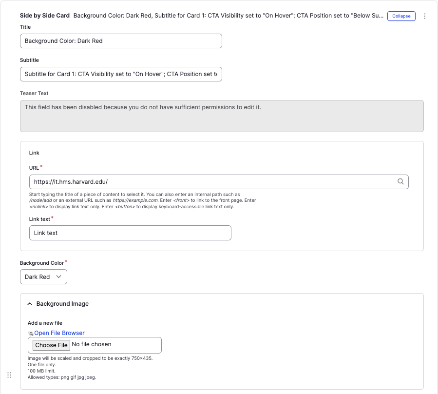
- Title - Enter a section title, which will display in large font.
- Subtitle - Enter a short description, if desired. Displays below the title.
- Teaser Text - If enabled, enter a text description of the content of the card.
- Link - The link field is optional. If both the URL and Link Text fields have values filled in, the entire card will become a link. If both fields are left empty, no link will be rendered.
- URL - Enter the URL of the page the user will be brought to.
- Link text - Enter a title that describes the link destination. This is the text displayed as the clickable text. For example, "Learn more".
- Background Color - Choose between Dark Red, Dark Gray, or White. If you upload a Background Image or Background Video, the image/video will override this section.
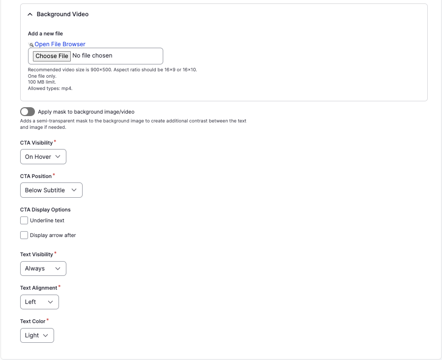
- Background Image and Background Video- If desired, upload an image or video which will display as the background. Select Choose File, then select the desired file. Review DAS's helpful hints for writing alt text for images.
- Note - Be mindful of choosing an image or video that ensures sufficient color contrast. If needed, enable the Apply make to background image/video option to create an overlay.
- CTA Visibility - Controls the visibility of the "Link" text.
- On Hover - Link text will display when the user hovers over the card if using a mouse or focuses within the card if using a keyboard.
- Always - Link text will always be displayed.
- CTA Position - Controls the position of the "Link" text.
- Bottom of Card - Link text will display at the bottom of the card.
- Below the Subtitle - Link text will display directly below the subtitle.
- CTA Display Options - Allows further customizability of the "Link" text.
- Underline text - Link text will appear with an underline.
- Display arrow after - Link text will appear with an arrow next to it.
- Text Visibility - Controls the initial visibility of ALL text within the card.
- On Hover - Card text will display when the user hovers over the card if using a mouse or focuses within the card if using a keyboard.
- Always - Card text will always be displayed.
- Text Alignment - Controls the alignment of text: Left, Centered, or Right.
- Text Color - Controls the color of the text:
- Light - Use when the selected background color is dark (for example, Dark Red or Dark Grey) or when using an image/video.
- Dark - Use when the selected background color is light (for example, White).
- To delete the entire component, tap Remove. Then, tap Confirm removal.
- Select Save. If you are ready to publish your page, ensure the Published toggle is enabled (green in color).
Examples
Front-end
Back-end