Spotlight Carousel component
Highlight featured stories in a carousel format.
This guide demonstrates how to add the Spotlight Carousel component, designed to highlight stories on your site. It can be used as an individual element (single) or as a carousel (more than one).
This feature works well with featured news items, ensuring they are a focal point with their own section.
Step by step
To add the Spotlight Carousel component:
- On the page you are creating or editing, select the Component tab. Then, tap the Components drop-down.

- Choose Add Spotlight Carousel.
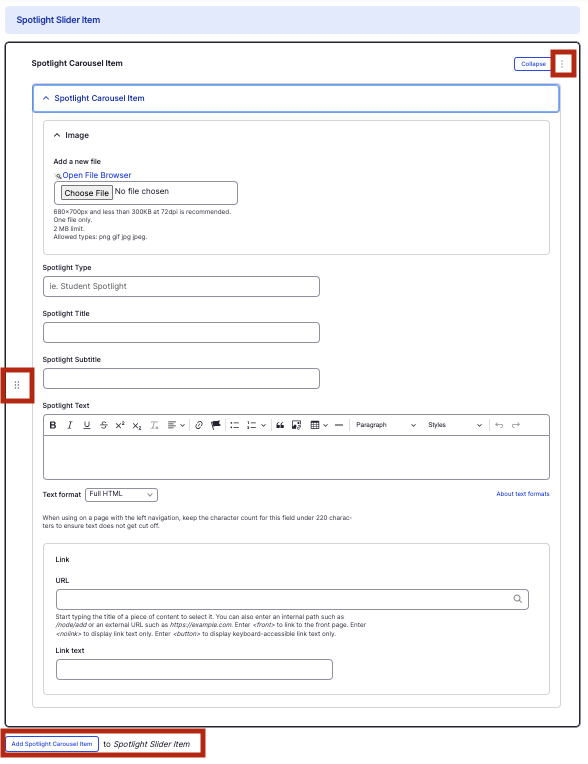
- The component will appear. Complete the following fields:
- Image - Add an image, which will display as a background image on the left-hand side. Select Choose File, then select an image. Review DAS's helpful hints for writing alt text for images.
- Spotlight Type - Enter the type of content the resource is, displayed in small letters above the title.
- Spotlight Title - Enter the title of the content, displayed in large font on the second line.
- Spotlight Subtitle - Enter a short description, displayed in small letters below the title.
- Spotlight Text - Enter a description, displayed as the body of the content.
- Link URL - Enter the URL of the page the user will be brought to.
- Link text - Enter a title that describes the link destination. For example, "HMS IT homepage".
- To add another item, select Add Spotlight Carousel Item.
- Additional actions you can take include:
- To move or rearrange the order of items, drag and drop a section to the position you'd like using the 6 dots, found to the left of the item.
- To remove a single resource, tap the three dots within the item section, then select Remove.
- To delete the entire component, tap Remove. Then, tap Confirm removal.
- Select Save. If you are ready to publish your page, ensure the Published toggle is enabled (green in color).
Example
Front-end
Back-end