Text Navigation with Image Cards component
Display visually-appealing quick links to internal and external pages.
This guide demonstrates how to use the Text Navigation with Image Cards component to display a set of cards with brief details as well as a background image, designed to guide visitors to both internal and external pages from your site.
Step by step
To add the Text Navigation with Image Cards component:
- On the page you are creating or editing, select the Component tab. Then, tap the Components drop-down.

- Choose Add Text Navigation with Image Cards.
- The component will appear. Complete the following fields:
- Component Title - Enter a title for the section. This appears as a heading above the cards.
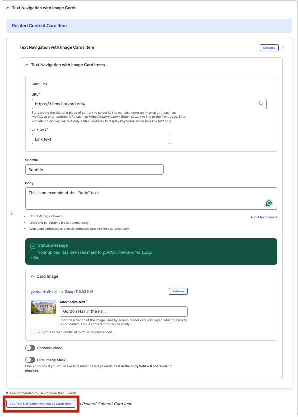
- Text Navigation with Image Cards Item
- URL - Enter the URL of the page the user will be brought to.
- Link text - Enter a title that describes the link destination. For example, "IT Org Chart".
- Subtitle - Enter a subtitle to be displayed in bold at the top of the image.
- Body - Enter a short description (if desired) to be displayed after the Subtitle.
- Image - Add an image, which will display behind the text. Select Choose file, then select an image from your desktop. Review DAS's helpful hints for writing alt text for images.
- Contains Video - If the file you chose is a video, ensure this is enabled.
- Hide Image Mask - If the file you chose is very light (watermarked), enable this. Otherwise, leave disabled to ensure your text can be seen appropriately. Reference the examples below to visually see the difference (first card is disabled, second card is enabled).
- To add another text navigation card, select Add Text Navigation with Image Cards Item.
- Additional actions you can take include:
- To move or rearrange the order of items, drag and drop a section to the position you'd like using the 6 dots, found to the left of the item.
- To remove a single resource, tap the three dots within the item section, then select Remove.
- To delete the entire component, tap Remove. Then, tap Confirm removal.
- Select Save. If you are ready to publish your page, ensure the Published toggle is enabled (green in color).
Example
Front-end
Back-end