Visual Navigation Cards component
Navigate to Departments within HMS.
This guide demonstrates how to add the Visual Navigation Cards component. The Visual Navigation Cards component displays a series of cards with brief information and a background image, designed to help users navigate to Departments within HMS.
You can select only Departments in the page reference fields, and these cards can link to both internal and external department sites. Card content—including image, title, subtitle, and teaser text—is managed on the Teaser tab of each Department.
Step by step
To add the Visual Navigation Cards component:
- On the page you are creating or editing, select the Component tab. Then, tap the Components drop-down.

- Choose Add Visual Navigation Cards.
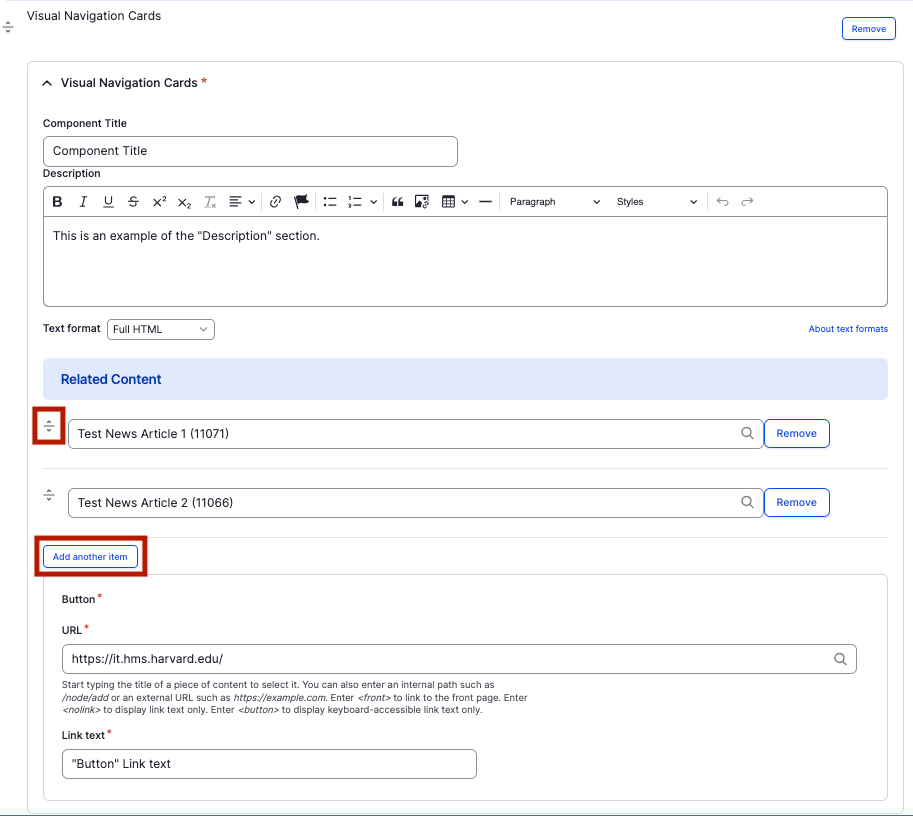
- The component will appear. Complete the following fields:
- Component Title - Enter a title for the section. This appears as a heading above the cards.
- Description - Enter a short description of the section. This appears below the Component Title.
- Related Content - Enter the title of the internal page you wish to link to. Select the correct page from the drop-down.
- "Add another item" - Tap this button to add another linked page.
- If you have multiple card items and would like to change the order, use the carrot icon (found to the left of the item) to drag and drop in your desired position.
- Button - If you wish to add another link outside the linked card item:
- URL - Enter the URL of the page the user will be brought to.
- Link text - Enter a title that describes the link destination. For example, "IT Org Chart".
- To add another text navigation card, select Add Text Navigation with Image Cards Item.
- Additional actions you can take include:
- To move or rearrange the order of items, drag and drop a section to the position you'd like using the 6 dots, found to the left of the item.
- To remove a single resource, tap the three dots within the item section, then select Remove.
- To delete the entire component, tap Remove. Then, tap Confirm removal.
- Select Save. If you are ready to publish your page, ensure the Published toggle is enabled (green in color).