Full Width Inner Page content type
Create a page with a full width image and CTA box at the top.
This guide demonstrates how to create a basic inner page with a full-width banner image at the top using the Full Width Inner Page content type. If you do not see this content available, please contact the web team.
Step by step
To create a Full Width Inner Page:
- Select Content >> Add content >> Full Width Inner Page.
- A "Full Width Inner Page" template will appear. While the format is similar to creating a basic page, there are a few differences:
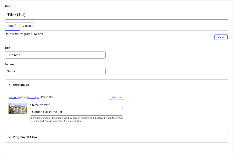
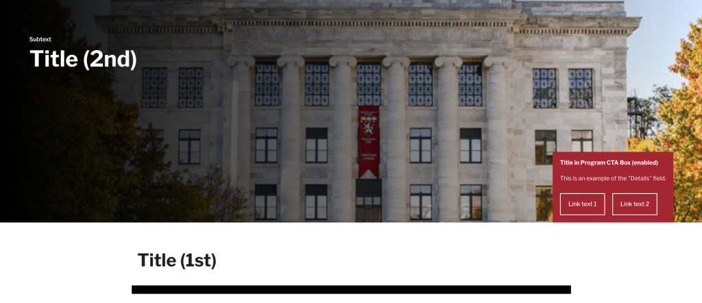
- Title - Enter a title for your page. This will appear in large letters at the top of the body section (not on the image). This will also become your default navigation URL.
- Title - Enter a title for your page. This will appear in large letters at the top of the body section (not on the image). This will also become your default navigation URL.
- In the Hero tab, complete the following:
- Title - Enter the title of your page. This can either be the same as your Title, different, or left blank. This will appear on the image at the top of the page.
- Subtitle - Enter a short description of your page. This will appear in small font above the title.
- Hero Image - Add a Hero Image to be displayed as a top banner image to your page. Select Choose file, then select an image from your desktop. Review DAS's helpful hints for writing alt text for images.
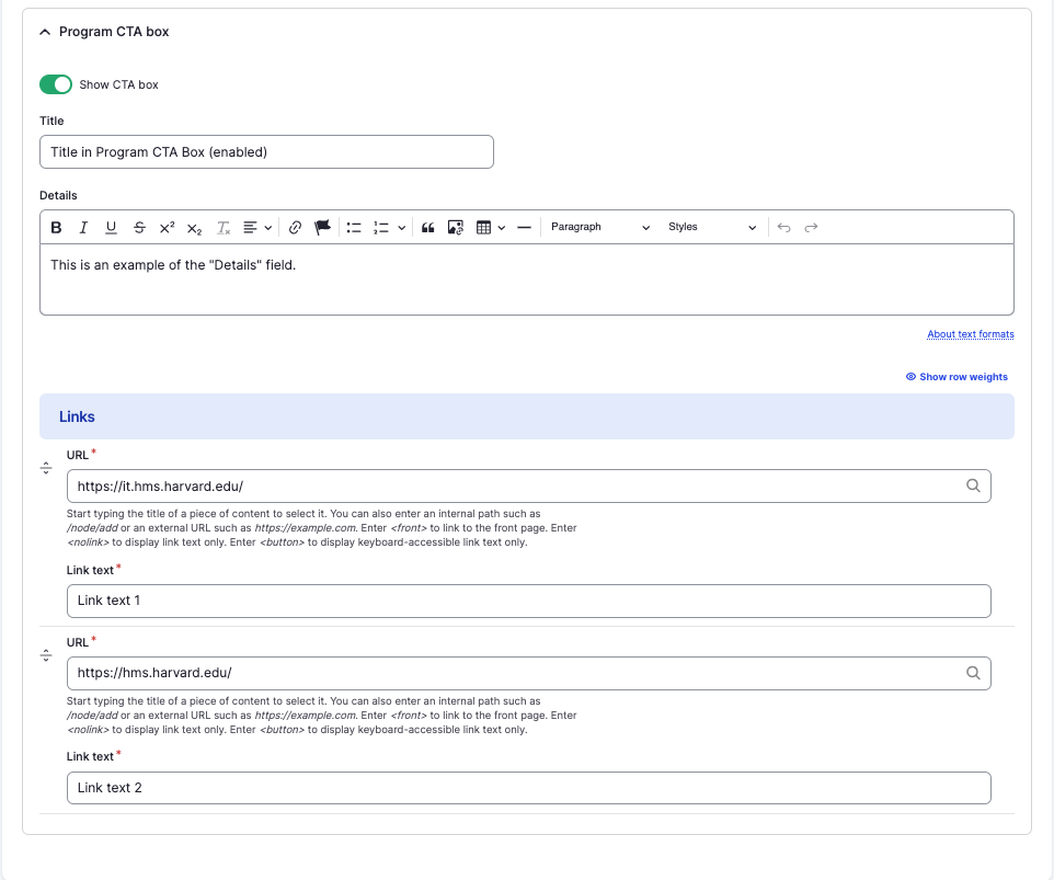
- Program CTA box - A CTA box will enable 1-2 links at the top of your page. The CTA box appears as a red box in the lower right hand corner of the banner image. Tap the section to expand. If desired, complete the following:
- Enable the "Show CTA box" toggle (green in color).
- Title - Enter a title for the Program CTA box.
- Details - Enter a short description of the Program CTA box.
- Links - Complete 1-2 links to be displayed:
- URL - Enter the URL of the page the user will be brought to.
- Link text - Enter a title that describes the link destination. For example, "IT Org Chart".
- In the Content tab, you can add from a variety of components. Adding components is not required, but can add style and choice to your page.
- To add a component, tap the Add accordion component dropdown, found at the bottom of the Components tab. Select which component you would like to add.
- Drag and drop a component to the position you'd like on the page using the slider, found in the upper left-hand corner of the component.
- To delete a component, tap Remove. Then, tap Confirm removal.
- Select Save. If you are ready to publish your page, ensure the Published toggle is enabled (green in color).
Examples
Front-end
Back-end