Using the WYSIWYG editor
Understand the icons on the WYSIWYG editor.
This guide demonstrates the various components in the WYSIWYG editor, which is displayed in the "Content" section of every page.
The WYSIWYG ("What You See Is What You Get", pronounced WHIZ-EE-WIG) editor allows users to format content in a visual way, similar to a word processor, with the changes appearing as they would on the final published page. It's also sometimes referred to as a rich text editor.

Table of Contents
- Text formatting icons
- Table icon
- Link icon
- Lists icon
- Callout icon
- Image icon
- Heading structure
- Undo/Redo icons
WYSIWYG Components
Text formatting icons
The text formatting icons are:
- B - Bold text
- I - Italicized text
- U - Underline text
S- Strikethrough text- X2 - Superscript
- X2 - Subscript
- Tx - Remove text formatting
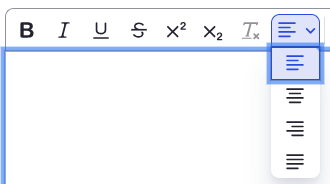
To change the text alignment:
- Select the paragraph lines icon dropdown.
- Select your preferred alignment: left-aligned, centered, right-aligned, or justified.
Table icon
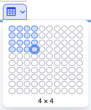
To create a table:
- Tap the table icon to create a table. Choose the dimensions of your table.
- Enter the information in the table.
- To ensure your table is digitally accessible, mark your row and/or column headers.
- Highlight the row that is the header.
- Select the drop-down next to the row icon.
- Enable the Header row toggle.
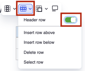
- The header row will appear grey.
- If you have columns that are also headers, complete the same steps (but for columns).
Refer to the Building tables best practices page (Harvard Digital Accessibility Services) for help on creating digitally accessible tables. This is an accessibility best practice.
Link icon
To use the link icon:
- Highlight the text you wish to link.
- Refer to the Write helpful links page (Harvard Digital Accessibility Services) for help writing descriptive links. This is an accessibility best practice.
- Select the link icon (chain link) on the WYSIWIG toolbar.
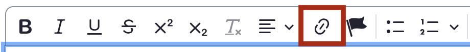
- The link details pop-up will appear.
- The link URL is the web address or path where users will go on the page when they select the link.
- The title text is the actual text of the link, which you highlighted before adding the link.
- In the advanced section, you can add CSS classes, IDs, and link relationships. You can also choose to have the link open in a new window (rather than a new tab).
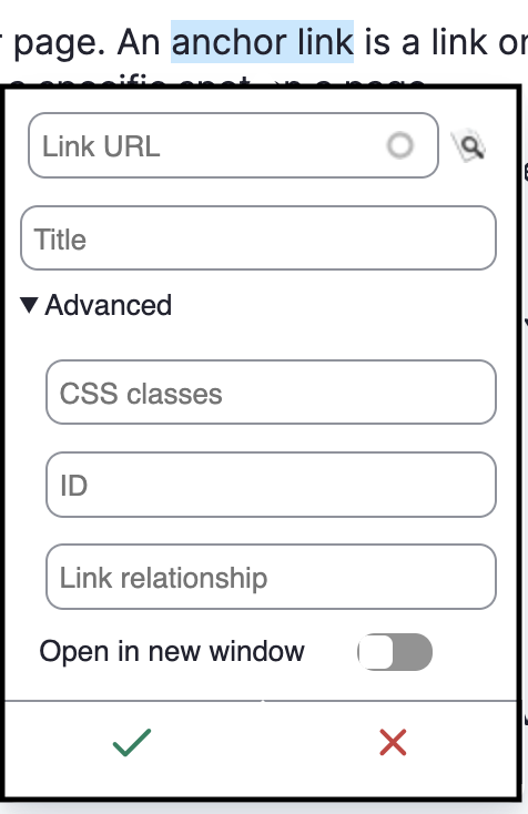
- When finished, select the green check button.
Your text should now be highlighted blue, indicating that it is linked. Test the link to ensure it functions the way you intended.
Lists icons
Use the bulleted list icon (left) to create a bulleted list. Use the numbered list icon (right) to create a numbered list.
Callout icon
Use the callout button to create a callout on your page. Callouts appear like:
Note - This is an example of a callout.
Image icon
Refer to the uploading images page for information on how to upload and manage images.
Heading structure
Use proper heading structure to create digitally accessible sites. Headings are important orientation aids, and they help people quickly identify the content on your page. When headings are correctly identified, they also allow screen reader users to quickly navigate from heading to heading using the screen reader's heading navigation functionality.
Headings should not be used as a style option. Screen reader users rely on the heading structure to navigate your page. Headings must follow the proper structure.
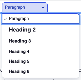
- Heading 2 is the "top-most" heading structure you should use. Heading 1 is identified as the title of your page (which is why it is not an option).
- If you are using a Heading 2 and you would like to create a sub-heading, select Heading 3. To create a sub-heading of Heading 3, select Heading 4.
- A page with multiple heading structures may appear as follows:
- Heading 2
- Heading 3
- Heading 3
- Heading 4
- Heading 3
- Heading 2
- Heading 2
- Heading 3
- Heading 2
The various components appear visually as follows:
- Paragraph - This is your basic text in the body of your content.
Heading 2
Heading 3
Heading 4
Heading 5
Heading 6
Undo and Redo icons
Use the back arrow icon (left) to undo an edit. Use the forward icon (right) to redo an edit.