Text Navigation Cards component
Display quick links to internal pages.
This guide demonstrates how to use the Text Navigation Cards component to display a set of cards with brief details, designed to guide visitors to related or child pages within your site.
Note - This component only supports internal links; for external links, use the Text Navigation with Image Cards component.
Step by step
To add the Text Navigation Card component:
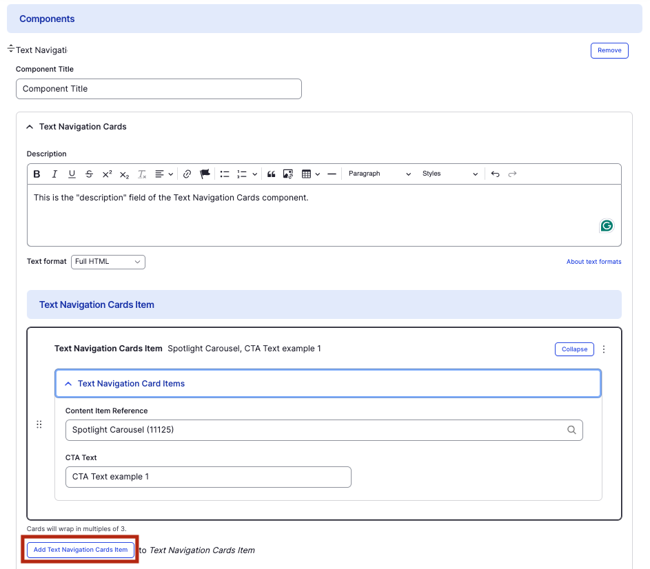
- On the page you are creating or editing, select the Component tab. Then, tap the Components drop-down.

- Choose Add Text Navigation Cards.
- The component will appear. Complete the following fields:
- Component Title - Enter a title for the section. This appears as a heading above the cards.
- Description - Enter a short description of the section.
- Text Navigation Cards Item
- Content Item Reference - Enter the title of the internal page you wish to link to. Select the correct page from the drop-down.
- CTA Text - Enter a short description of the link destination.
- To add another text navigation card, select Add Text Navigation Cards Item.
- Additional actions you can take include:
- To move or rearrange the order of items, drag and drop a section to the position you'd like using the 6 dots, found to the left of the item.
- To remove a single resource, tap the three dots within the item section, then select Remove.
- To delete the entire component, tap Remove. Then, tap Confirm removal.
- Select Save. If you are ready to publish your page, ensure the Published toggle is enabled (green in color).
Example
Front-end
Back-end